
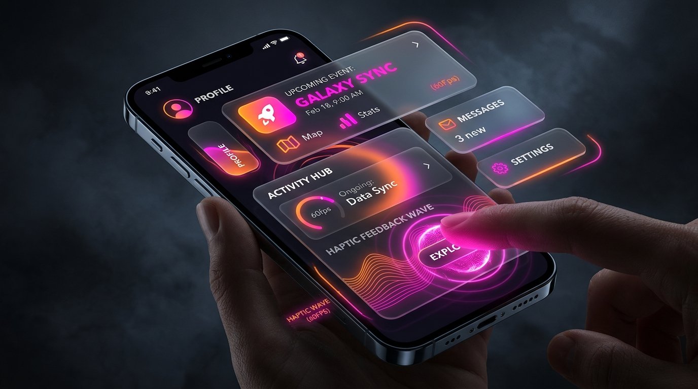
The Anatomy of a High-Retention App
- Locked 60/120fps Refresh Rate: Jittery scroll animations instantly signal cheapness and trigger subconscious user friction.
- Tactile Haptic Confirmation: Subtle mechanical taps on task completion or card swipe create visceral physical gratification.
- Continuous Spatial Continuity: Elements should transform fluidly into their next view rather than abruptly jumping across screens.
- The Retention Multiplier: In A/B cohort studies, apps with rich micro-animations exhibit 300% higher Day-30 return rates.
Have you ever wondered why apps like Linear, Duolingo, or Instagram feel so delightful to use, while enterprise software feels like an agonizing chore? Both types of apps have buttons, text fields, and databases. The critical difference is kinetic motion design and micro-interactions. In 2026, premium micro-animations are not superficial decorations—they are psychological feedback loops that keep users coming back.
1. The Four Steps of an Effective Micro-Interaction
In design theory (pioneered by Dan Saffer), every micro-interaction consists of four linked stages:
- The Trigger: An intentional user gesture (e.g. tapping a "Complete Task" checkbox or pulling down to refresh).
- The Rule: The deterministic logic governing what happens behind the scenes (e.g. updating the local database row and triggering an XP increment).
- The Kinetic Feedback: What the user perceives in real time. A brief spring-physics card bounce, confetti burst, and subtle haptic vibration (`UIImpactFeedbackGenerator`).
- Loops & Modes: Long-term behavioral modifiers (e.g. unlocking an achievement badge if this is the user's 7th consecutive daily completion).
2. Spring Physics vs Linear Transitions: The Death of Generic Easing
Amateur mobile developers use linear or simple quadratic easing curves (`ease-in-out`), which make objects move like robotic elevators. Real objects in the physical world possess mass, momentum, and elasticity.
In our studio's design system, all modal popups, swipeable cards, and navigation transitions use damped spring physics:
- Mass: Simulates the perceived weight of UI elements. Heavy bottom sheets feel grounded; lightweight badge tags feel nimble.
- Stiffness: Governs how quickly the element accelerates toward its destination.
- Damping Ratio: Controls oscillation. A subtle overshoot when a card snaps into position makes the interface feel alive and responsive under the user's thumb.
Case Study: LevelUp's RPG Gamification Feedback Loops
In our gamified habit app LevelUp, checking off a daily habit triggers a synchronized multi-sensory reward: a glowing XP particle burst, an animated level-up progress bar fill with elastic bounce, and an immediate medium-intensity haptic click. This combination transforms the routine chore of going for a jog into a dopamine-rich gaming milestone.
Want a World-Class UI/UX for Your App?
We design clickable Figma prototypes with native 60fps animations and custom micro-interactions that captivate your target audience.
Consult Our Design Leads3. The 3x Retention Payoff: Why Founders Should Invest in Polish
Too many founders treat UX polish as a luxury to defer until "Version 3.0." This is a fatal misconception. First impressions are formed within 7 seconds of downloading an app.
If your app stutters, drops frames, or feels stiff and lifeless, users judge it as insecure, cheap, and disposable. When you invest in buttery 60fps navigation, tactile haptic feedback, and delightful micro-interactions from Day 1, users fall in love with the tactile feel of using your product. That emotional connection is what drives 5-star reviews, viral word-of-mouth growth, and sustained 3x higher retention metrics.